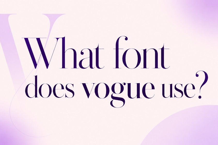
If you have ever seen a Vogue cover and wondered why the masthead feels so elegant, confident, and instantly recognisable, the answer is largely connected to typography. Many designers, students, fashion bloggers, and creators search for what font does vogue use because they want to understand the design language behind one of the most famous fashion magazine identities.
The challenge is that the answer is not always as simple as naming one downloadable font. Vogue’s logo is a carefully recognised brand wordmark, and it is commonly associated with a Didot-style high-contrast serif. That means it has the refined features people expect from luxury editorial design: thin hairlines, dramatic contrast, tall letterforms, and elegant spacing.
However, the exact Vogue wordmark may include custom adjustments. Magazine covers, editorial layouts, websites, and campaign graphics can also use different fonts depending on the issue, region, format, or creative direction.
This guide explains what font Vogue is commonly linked to, why Didot became so strongly connected with fashion typography, how similar fonts compare, and how you can create a Vogue-inspired look safely without copying official brand assets.
What font does Vogue use?
Vogue’s logo is commonly associated with a modified Didot-style high-contrast serif typeface. The exact wordmark should be treated as a protected brand asset, but Didot, Bodoni, and similar elegant serif fonts can create a Vogue-inspired editorial look.
What Font Does Vogue Use for Its Logo?
Vogue’s logo is most commonly associated with Didot, a high-contrast serif typeface known for its elegant and editorial character. Didot has thin hairlines, strong vertical strokes, sharp serifs, and a polished appearance that fits fashion, beauty, luxury, and magazine design extremely well.
Still, it is important to understand the difference between a font and a wordmark. A font is a typeface file that designers can use to set text. A wordmark is a brand logo made from letters, often customised for balance, recognition, and visual ownership.
The Vogue masthead may look like Didot, but it should not be treated as a simple typed word that anyone can copy exactly. Major publishing and fashion brands often refine letter spacing, stroke details, proportions, and optical balance to create a unique logo. Those small changes can make a wordmark feel more premium and more memorable.
This is why typing “VOGUE” in a Didot font can create a similar mood, but it may not perfectly match the official logo. The official version is part of Vogue’s brand identity.
For most creative work, the practical answer is simple: use Didot or a similar high-contrast serif if you want a Vogue-style fashion editorial look. Use the style as inspiration, not as a direct copy of the brand.
Why Didot Became the Signature Vogue-Style Font
Didot belongs to a category of typefaces often called Didone. These fonts are known for dramatic contrast between thick and thin strokes. They also have vertical stress, fine serifs, and a clean, formal structure.
That combination makes Didot feel luxurious without needing extra decoration. It communicates elegance through proportion rather than effects. This is one reason Didot-style typography has become common in fashion magazines, beauty branding, premium packaging, and editorial design.
High Contrast Creates a Luxury Feel
The most recognisable feature of Didot is contrast. Thick vertical lines sit beside extremely thin hairlines. This gives the font a sharp, polished, and high-fashion look.
On a magazine cover, contrast matters because the masthead must stand out over photography. A bold sans serif might feel too commercial. A script font might feel too soft. A Didot-style serif feels elegant but still strong enough to command attention.
Thin Hairlines Add Refinement
The delicate strokes in Didot give it a refined quality. They make the letters look carefully crafted, which is why similar fonts often appear in fashion editorials, perfume packaging, beauty campaigns, and luxury invitations.
The only drawback is readability at small sizes. Hairline serifs can become difficult to see on low-resolution screens or small mobile layouts. That is why Didot-style fonts work best for large headlines, mastheads, posters, and short display text.
Uppercase Letters Feel Editorial
The Vogue logo uses uppercase styling, which gives the masthead authority and presence. Uppercase serif letters can feel formal, balanced, and iconic when the spacing is handled well.
This is one of the lessons designers can take from Vogue-style typography. The font matters, but spacing matters just as much. Poor letter spacing can make even a beautiful font look cheap or awkward.
Simplicity Makes It Timeless
The Vogue look does not rely on heavy shadows, outlines, gradients, or trendy effects. The strength comes from restraint. A clean high-contrast serif, balanced spacing, strong photography, and a simple layout can create a premium visual tone.
That restraint is what makes Vogue-style typography feel timeless rather than temporary.
Vogue Logo Font vs Vogue Magazine Fonts
A common mistake is thinking Vogue uses one font everywhere. In reality, a magazine brand usually uses a wider typographic system. The logo, cover lines, headlines, body text, captions, digital pages, and campaign materials may all use different fonts.
The Vogue logo is the most famous typographic element, but it is not the whole design system. Editorial design needs flexibility. A cover may use a Didot-style masthead with clean sans serif cover lines. A feature article may use a different serif headline and a readable body font. A website may prioritise screen-friendly fonts for navigation and article text.
Here is the difference:
- Logo or masthead: The iconic Vogue wordmark, commonly linked to a modified Didot-style look.
- Cover lines: Short text used on magazine covers, often chosen for visual hierarchy.
- Editorial headlines: Fonts selected for article titles, fashion features, and visual storytelling.
- Body copy: Readable fonts used for long-form articles.
- Digital interface text: Fonts chosen for websites, mobile screens, menus, and navigation.
- Campaign typography: Fonts used for special issues, advertising, collaborations, or events.
This distinction is useful because people asking “what font does Vogue use?” may mean different things. Some want the logo style. Others want the magazine cover look. Others want to create fashion-inspired graphics for social media or branding.
If your goal is a Vogue-inspired design, focus on the design principles rather than copying one asset. Use a high-contrast serif, strong spacing, clean layout, and premium imagery.
This differs from social platform typography. For example, an article about what font does twitter use would focus more on interface readability and digital product experience, while Vogue-style typography is more about luxury identity, editorial presence, and visual drama.
Similar Fonts to Vogue for Editorial Designs
You do not need the exact Vogue wordmark to create a similar design mood. Several elegant serif fonts can help you build a fashion-inspired look while keeping your work original and legally safer.
The best option depends on the project. A fashion blog header needs readability. A magazine cover concept needs drama. A beauty brand logo needs elegance and licensing clarity. A social media graphic may need something readable on mobile.
Useful Vogue-style font alternatives include:
- Didot: The closest commonly recognised style connected with Vogue’s logo.
- Linotype Didot: A polished version suitable for refined editorial work.
- HTF Didot: A premium display option with strong fashion appeal.
- Bodoni: Another classic high-contrast serif with a dramatic luxury feel.
- Bodoni 72: Often available on Apple systems and useful for elegant headings.
- Playfair Display: A free Google Fonts option inspired by high-contrast editorial type.
- Libre Bodoni: A free serif option with a magazine-style character.
- Prata: A refined display serif for fashion-inspired headings.
- Cormorant Garamond: Softer and more literary, but still elegant.
- Abril Fatface: Bolder and more expressive for large editorial statements.
For Canva users, search for Didot-style or Bodoni-style fonts. For Figma and website mockups, Playfair Display, Libre Bodoni, and Prata are practical options from Google Fonts. For professional editorial work, Adobe Fonts may offer more refined serif families.
A simple fashion-style pairing could look like this:
Headline: Playfair Display
Subheading: Libre Bodoni
Body text: Inter or Lato
A more premium editorial pairing might look like this:
Headline: Didot or Bodoni
Subheading: Cormorant Garamond
Body text: Helvetica Neue or a clean sans serif
Always check the font licence before using any typeface commercially. A font may be free for personal use but require a licence for logos, client projects, advertising, product packaging, or commercial websites.
The VOGUE Framework for Choosing a Fashion Serif
Use the VOGUE Framework when choosing a Vogue-inspired font for your own design. It helps you create the right mood without copying the official brand identity.
V — Verify the Font Style
Start by checking whether the font has the right structure. A Vogue-style font is usually a high-contrast serif, not a casual script, modern geometric sans serif, or playful display font.
Look for thin hairlines, sharp serifs, tall letterforms, strong vertical strokes, and a refined editorial feel.
O — Observe the Design Context
Think about where the font will appear. A logo concept, magazine cover, fashion blog header, social post, website hero, and printed invitation all need different levels of readability.
A thin Didot-style font may look excellent in a large title but weak in small mobile text. Always test the font in the real size and format.
G — Gather Similar Alternatives
Compare several fonts before choosing one. Try Didot, Bodoni, Playfair Display, Libre Bodoni, Prata, and Cormorant Garamond with the same word or headline.
This makes the differences easier to see. Some fonts feel sharper and more luxurious. Others feel warmer, softer, or more artistic.
U — Use It with Care
A Vogue-inspired design should feel elegant, not copied. Avoid using the Vogue logo, name, cover layout, or official brand assets in a way that could confuse people.
Use the style direction instead: high contrast, clean spacing, strong photography, and a restrained colour palette.
E — Experiment with Safe Text Styles
For short bios, captions, usernames, or fashion-inspired profile text, a Font generator can help create copy-and-paste styles. This is different from using the official Vogue wordmark or a commercial font file.
Use decorative text sparingly. It can look attractive in short phrases, but it may reduce readability if used too often.
The simple formula is:
Vogue-Style Typography = High Contrast Serif + Elegant Spacing + Editorial Balance + Luxury Visual Tone
A font alone will not create the full Vogue-style effect. The layout, spacing, image choice, contrast, and restraint all work together.
How to Create Vogue-Inspired Text Without Copying Vogue
Many readers searching for what font does vogue use want a practical way to create fashion-inspired graphics, headers, captions, or profile text. The safest approach is to study the design language, then apply it in your own way.
Start with the purpose. Are you creating a blog logo, a fashion moodboard, a magazine-style poster, a beauty brand concept, or an Instagram graphic? Your answer changes the font choice.
For a blog header, use a readable high-contrast serif and simple supporting text. For a poster, use stronger uppercase letters and wider spacing. For a social caption, keep the styling short and easy to read.
Follow this simple process:
- Choose a high-contrast serif such as Didot, Bodoni, Playfair Display, or Libre Bodoni.
- Use uppercase text for a stronger editorial look.
- Add careful letter spacing.
- Pair the serif with a clean sans serif.
- Keep the background simple.
- Avoid heavy effects such as thick shadows or outlines.
- Test readability on desktop and mobile.
- Check the font licence before commercial use.
- Avoid copying Vogue’s official logo or cover layout.
- Use decorative text only for short creative accents.
Here are simple examples:
Plain text: Fashion Notes
Editorial style: FASHION NOTES
Soft luxury style: Fashion Journal
Caption style: 𝑭𝒂𝒔𝒉𝒊𝒐𝒏 𝑵𝒐𝒕𝒆𝒔
Bold style: 𝐅𝐚𝐬𝐡𝐢𝐨𝐧 𝐍𝐨𝐭𝐞𝐬
These styles can work for short creative text, but they should not replace normal readable writing. Some decorative Unicode characters may not display correctly on every device or may be difficult for screen readers.
Useful tools include Canva for quick graphics, Figma for layout testing, Adobe Photoshop for visual editing, Adobe InDesign for editorial layouts, Google Fonts for free alternatives, Adobe Fonts for professional font families, Font Squirrel for licence-friendly options, and typography identifier tools for research.
Conclusion
The clearest answer is that Vogue’s logo is commonly associated with a modified Didot-style high-contrast serif. Didot’s thin hairlines, dramatic stroke contrast, elegant spacing, and editorial tone are what make it feel so connected to luxury fashion publishing.
Still, Vogue’s official wordmark should be treated as a brand asset, not just a regular font anyone can copy. If you want a similar look, use fonts such as Didot, Bodoni, Playfair Display, Libre Bodoni, Prata, or Cormorant Garamond to create your own fashion-inspired design direction.
The real lesson is that Vogue-style typography is not only about the font. It is about balance, spacing, layout, photography, and restraint. A high-contrast serif can give you the mood, but careful design decisions create the premium result.
For your next design, choose a refined serif, test it at the right size, pair it with a clean supporting font, and use the Vogue look as inspiration rather than imitation.
FAQs
What font does Vogue use for its logo?
Vogue’s logo is commonly associated with a modified Didot-style serif typeface. It has thin hairlines, strong contrast, tall uppercase letters, and an elegant editorial feel. The exact official wordmark should be treated as a protected brand asset rather than a standard downloadable font.
Is the Vogue font exactly Didot?
Not exactly. Vogue is widely linked with Didot-style typography, but the official wordmark may include custom spacing, proportions, and letter adjustments. Typing “VOGUE” in Didot can create a similar look, but it may not perfectly match the official logo.
What font is closest to Vogue?
Didot is the closest commonly recognised option. Other similar fonts include Bodoni, Linotype Didot, HTF Didot, Playfair Display, Libre Bodoni, Prata, and Cormorant Garamond. These fonts share elegant serif qualities suitable for fashion and editorial design.
Can I use Vogue-style fonts for my brand?
Yes, you can use legally licensed Didot-style fonts for your own design work. However, you should avoid copying the official Vogue logo or creating branding that implies a connection with Vogue. Always check the font licence before commercial use.
Why does Vogue use a high-contrast serif style?
High-contrast serif typography feels refined, elegant, and editorial. Thin hairlines and strong vertical strokes create a luxury tone that works well for fashion covers, beauty campaigns, and premium branding. This style gives Vogue its classic and recognisable visual presence.
How can I make text look Vogue-inspired?
Use a high-contrast serif such as Didot, Bodoni, Playfair Display, or Libre Bodoni. Add careful spacing, use clean layouts, avoid heavy effects, and pair the serif with a simple sans serif. For short captions or bios, decorative copy-and-paste styles can also help.